Feeling like your brand isn’t sticking in people’s minds? Consistent colors in your logo might just be the magic wand you need. A strong brand isn’t just about looking good—it’s about being memorable, consistent, and using colors that hit your audience right in the feels. Consistency in brand colors not only helps in creating a recognizable identity but also plays a crucial role in building trust and emotional connection with your audience. Let’s dive into why standardized colors are essential for your brand and how they can be a game-changer.
Why Standardized Colors are Crucial for Your Brand
Colors aren’t just for making things pretty. They’re powerful tools that reinforce your brand’s message and make it pop. When your brand colors are consistent, they create a cohesive and professional image, making your brand instantly recognizable. But it’s more than just looking good; it’s about being unforgettable and trustworthy. Consistent use of colors helps in maintaining a uniform brand image across various platforms, from your website and social media to packaging and promotional materials.
Benefits of Standardized Colors
Recognition and Consistency
Consistency in brand colors helps your brand become instantly recognizable and reinforces your brand identity across all platforms.
- Immediate Recognition: Your brand colors are like your signature. Keep them consistent, and your brand will be instantly recognizable anywhere. Think about brands like Coca-Cola or McDonald’s—their colors are instantly identifiable, no matter where you are in the world. This kind of consistency reinforces brand identity and builds a strong presence in the market. When customers see the same colors repeatedly, it creates a visual memory that is hard to forget.
- Psychological Impact: Us humans are simple—we process color faster than text or complex images. Color is one of the most powerful tools for quick brand recognition in the world of brand identity. It can evoke specific emotions and perceptions that influence how consumers feel about a brand, and it increases brand loyalty by 80%. Understanding the psychology behind different colors can help companies communicate their message and values more effectively. For instance, red can evoke feelings of excitement and passion, while blue often signifies trust and dependability.
- Consistency Across Mediums: To efficiently ensure brand consistency across different mediums, use the appropriate color models. For digital media, use the RGB (Red, Green, Blue) color model to ensure colors look consistent across various devices by using web-safe colors and testing on multiple screens. For print media, use the CMYK (Cyan, Magenta, Yellow, Black) color model. Utilize tools like the Pantone Matching System to ensure colors match exactly as intended in print. This helps in maintaining the same visual experience for your audience, regardless of the medium.
Emotional Connection
Colors evoke emotions, and using them strategically can help your brand connect with customers on a deeper emotional level.
Different colors evoke different emotions and can significantly influence a customer’s feelings and behaviors. For example:
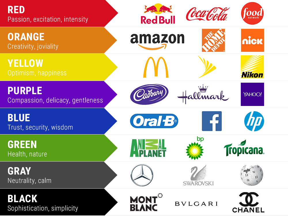
- Red: Red is a strong and powerful color that represents energy, passion, and urgency. It is particularly ideal for branding sports teams or high-energy brands on custom apparel. The vibrancy and intensity of red immediately grab attention and can signal a sense of excitement and movement.
- Blue: Blue generally communicates trust, stability, and professionalism. It works well for corporate branding, especially on items like polo shirts and hats. Blue’s calming and dependable nature helps evoke a sense of confidence and trust, making it an ideal choice for businesses that want to establish credibility.
- Green: Green suggests growth, health, and tranquility. It is perfect for eco-friendly brands or wellness companies’ branded products. The soothing and refreshing qualities of green evoke feelings of harmony and balance, appealing to consumers who prioritize sustainability and well-being.
- Yellow: Yellow stands for happiness, warmth, and optimism. It is excellent for positive, cheerful branding and can easily be adapted into casual wear like t-shirts. The bright and cheerful nature of yellow creates a sense of joy and enthusiasm, making it perfect for brands that want to convey a fun and uplifting image.
- Purple: Purple signifies luxury, creativity, and wisdom, making it ideal for high-end branding or creative agencies with custom merchandise. The rich and elegant qualities of purple evoke sophistication and innovation, appealing to consumers who value exclusivity and originality.
- Black: Black represents sophistication, elegance, and power. It is commonly used in fashion branding for premium-quality clothes. The sleek and timeless nature of black creates a sense of luxury and power, making it a popular choice for brands that want to project a high-end and refined image.
- White: White symbolizes purity, simplicity, and cleanliness. It is often used in healthcare or technology branding, especially on clean and crisp shirts and hats. The minimalist and pristine nature of white evokes feelings of clarity and efficiency, making it perfect for brands that want to convey a sense of precision and order.
Emotional Branding: By strategically using colors to evoke specific emotions and perceptions, businesses can enhance their brand identity and connect more deeply with their target audience. Emotional branding is about creating a relationship between the consumer and the product by appealing to their emotions. For example, the use of warm colors like red and yellow in food brands can stimulate appetite and create a sense of warmth and happiness.
Professionalism and Trust
Consistent use of color conveys professionalism and reliability, building trust with your audience over time.
- Building Trust: Consistent use of color is key when it comes to building trust with your customer. People will begin to recognize and rely on your brand when they continuously see the same colors pop up around it. After all, when you stick to the same color palette throughout everything you do, from your website to social media to custom apparel and promotional products, it establishes a unified and secure image for your brand. Trust is something that develops with time and through repeated pleasant experiences with a brand. When a brand uses the same colors repeatedly, it signals consistency. Customers get to know what to expect and, therefore, begin to trust the brand.
- Professional Image: Consistent colors scream professionalism and attention to detail, helping to build trust with your audience. When customers see the same colors used consistently across all your branding materials, it gives the impression that your company is reliable and meticulous. This level of professionalism can set you apart from competitors and create a positive image in the minds of your audience.
Cost Efficiency
Standardized colors can lead to significant cost savings by reducing time, labor, and material costs, and improving overall operational efficiency.

- Reduces Time and Labor Costs: Standardized colors not only enhance brand recognition and trust but also play a crucial role in reducing costs across various aspects of production and marketing. By maintaining consistent colors, brands can streamline their operations, optimize material usage, and improve overall efficiency. Consistent color usage minimizes the need for retraining staff on new color processes and less time spent on quality control and adjustments. This efficiency can lead to significant cost savings in the long run.
- Should You Screen Print or Not?: To ensure you get what you asked for in terms of quality and consistency, it’s important to count the colors in your logo. If your logo has six colors or less, it can be screen printed, which is cost-effective and ideal for bulk orders. However, if your logo has more than six colors, it is better to go with Direct to Film (DTF) or Direct to Garment (DTG) printing. These methods are more suitable for detailed and colorful designs, ensuring that your branding is accurately represented.
- Allowing Bulk Purchasing of Materials: When you have clear color guidelines, you avoid the costs associated with color mismatches and redesigns. This is particularly important in industries where branding materials are produced in large quantities. Bulk purchasing of standardized color materials allows for discounts on larger orders, reduced shipping costs due to fewer, larger orders, and lower per-unit costs for materials. For example, a company that consistently uses a specific shade of blue can order large quantities of that color for various products and marketing materials, reducing costs associated with small, custom orders.
- Minimizing Inventory Management Costs: Standardized colors simplify inventory management, reducing the need for extensive warehousing of diverse color materials. This lowers the risk of overstock and obsolescence, decreases carrying costs, and improves cash flow. Simplifying inventory management with a standardized color palette makes it easier to track and manage inventory levels, ensuring that the right materials are always available when needed.
- Efficient Use of Marketing and Promotional Materials: Consistent colors enable the reuse of design assets across multiple campaigns. This reduces the need for new creative development, saving time and money. Streamlining marketing efforts with a unified visual identity maximizes the return on investment for marketing collateral. By not having to redesign promotional items for different campaigns, brands can achieve cost savings and maintain a cohesive brand image.
Streamlined Production
Clear color guidelines improve efficiency in design and production processes, reducing errors and delays.
Efficiency in Design and Production: Clear color guidelines speed up design and production, making everything run smoother. With standardized colors, your design team can work more efficiently, knowing exactly which colors to use. This consistency also helps in coordinating with suppliers and printers, reducing the time spent on approvals and adjustments. For instance, a graphic designer working on a new marketing campaign can quickly create designs that align with the brand’s color standards, reducing the need for multiple revisions and approval cycles.
Coordination with Suppliers: Consistency in colors ensures that suppliers and printers understand the exact requirements, leading to fewer errors and delays. This coordination is particularly important when dealing with multiple suppliers or when producing materials in different locations. Clear color guidelines enable suppliers to match colors accurately, ensuring that the final product meets the brand’s standards.
Tools for Color Accuracy
To maintain color accuracy and ensure consistency across various mediums, there are several tools and technologies you can utilize:
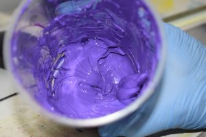
- Pantone Matching System (PMS): A standardized color reproduction system used in various industries to ensure color accuracy. PMS allows designers and manufacturers to communicate specific colors accurately, ensuring consistency across different materials and production methods. Here at Kaizink, we use Separo for automatic color separations and maximum accuracy. We also use Avient for efficient color mixing when creating our ink.
- Color Calibration: Regularly calibrating monitors and printers to ensure the colors displayed on screens and printed materials are accurate. Color calibration tools help maintain color consistency across different devices, reducing the risk of discrepancies between digital designs and printed products.
- Digital Asset Management (DAM) Systems: Software that helps maintain color consistency across all branding materials by storing and managing digital assets with standardized color codes. DAM systems provide a centralized repository for all branding materials, making it easy to ensure that colors are used consistently across various platforms and media.
Conclusion
By implementing standardized colors in your branding strategy, you can enhance brand recognition, build emotional connections, project professionalism, reduce costs, and streamline production processes. Embrace the power of consistent colors and watch your brand’s success flourish. The consistent use of brand colors is not just about aesthetics; it’s a strategic move that can significantly impact your brand’s growth and customer loyalty. Invest in the right tools and practices to maintain color accuracy and consistency, and you’ll see the long-term benefits for your brand.